

Above I have my business card and my logo. It took a wile to decide on what I wanted to base my logo on, and actually figure out how to display myself in a logo. I consider myself to be a simple person, so I really wanted my logo to reflect that aspect. I decided to just display my name. I am really appreciative on nature and I modeled my logo after tree branched and sticks, however I wanted to keep it smooth but natural. The color schema I choose is also inspired but nature. Brown is a trustworthy color, and symbolizes stability. I want to convey these senses to my potential customers. I also had to put my logo on three items. The three items I choose were a coffee mug, a towel, and my laptop case. These items are considered everyday items, and by putting my logo on these items (if I were to market these items) people would be intrigued and subject to seeing my logo multiple times a day.

I enjoyed this project. My class was able to get into the silk screen lab and learn a little bit about silk printing. what we did was take take separate printed out textures and transfer them on to a screen, then use ink that we mixed to print the patterns on to paper. We then had to create a book using the textures we made. I decided to made my book by glueing together two sheets of paper then sewing them together with thread. I wanted this book to tell some kind of story with out using words. The viewer can create a story centered around the images, so it is based around the concept of imagination and not a set story.
In class we went over what each color means, so here are some facts about each.
Red: Red is the color that attracts the eye the most. While red symbolizes passion, love, and infatuation, it also represents anger, war and hate. Red is used to convey a sense of danger and it compels the viewer. Orange: Represents warmth and creativity. Wearing the color orange has been proven to make you more approachable to strangers. Conveys a sense of happiness, joy, cheerfulness, and adventure. Yellow: Depending on the shade, yellow can either be an earthy color, or convey anxiety. Yellow can help you focus, however it can also be distracting. Yellow can covey senses of happiness, brightness, warning and caution. Green: Green is the color of life, fertility, and balance. Green is the color most associated with nature. Green is the color our eyes are able to see the easiest. Blue: Ironically, blue is the most popular color to like, however it is the least appetizing color. Blue is used to represent intelligence. Conveys a sense of comfort, loyalty, life, sadness, and cold. Violet (purple): Violet represents passion, spirituality, and virtue. Supernatural, and physic events are associated with violet. Some terms also associated with violet are Insomnia, introversion, and nightmares. Pink: Pink was originally a color used with males while blue was associated females. Because pink is a calming color, some prisons have pink cells. the perception of pink by our eyes is the absence of green. Brown: Conveys a sense of trust and dependance. gives off a homey feeling and a sense of belonging. Brown is associated with loyalty and trust. Grey: Represents the lack of emotion and being neutral. Grey makes the colors around it stand out to the viewers eye. Too much grey causes the viewer to feel uneasy and unstable. White: Represents completeness, emptiness, perfection, new beginnings, and peace. In some cultures, white is used to represent grief, and death. White is also the color of isolation.  (from left to right: Evening Sunset, Late Summer Leaves, Oak Tree, and Underbrush.)
Enjoy the calming atmosphere of trees, as leaves rustle in the wind. Sense the natural feel of tree bark as mulch and dirt crunch under your feet. And watch as the evening sun sets on the distant horizon. The colors of "In The Woods" are guaranteed to sooth your stress away at any time of the year.  What does the color brown mean in relation to...
· Emotions Warmth Safety Dependability Reliability Trust Familiarity · Psychology Makes you want to trust Relays a sense of intelligence Gives off an earthy feel The viewer feels grounded and secure Organization · Scientific If the color brown is in a dream, it means that you are/ will be lucky with money. A survey shows that people who own a brown car are Down to earth No-nonsense Simple tastes. In a study, dark brown beer, Is more nutritious than light brown Has the same health benefits as chocolate and red wine; Brown colored spices such as nutmeg and cinnamon have scents that are rejuvenating and uplifting. · Social impact UPS Customers need to trust the fact that their packages will get to where they need to go. Hospitality Friendliness Hershey Warm feelings The illusion to a sweet taste Comfort Natural product Represented with the color brown Sources: · http://www.sensationalcolor.com/color-meaning/color-meaning-symbolism-psychology/all-about-the-color-brown-4365#.VFF0UYvF-fs · http://www.businessinsider.com/branding-and-the-psychology-of-color-2012-12?op=1 · http://www.beading-design-jewelry.com/meaning-of-brown.html  This was another project I struggled with. The concept of the assignment was to create a composition that brought together components of pattern to engage the viewer. I created my composition based on a nature theme. in order to create depth in my work, I manipulated the value of each section. The brighter sections are where I laid down the most white pencil. this makes the plane stand out to the viewers eyes. This composition was not meant to have a focal point, so I created multiple areas where the viewer's eye can be attracted to. Clearly defining the boundaries of each plane was on of me struggles because I had to do so with my patterns.
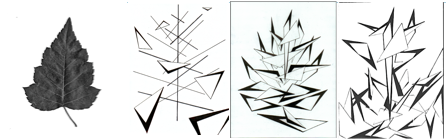
The objective of this assignment was to study shapes found in nature, or natural/organic shapes. The students would then create an abstraction from those shapes. The goal was to have two abstractions made, then reconstruct one in order to make a third abstraction. With my abstractions, I wanted to keep a sense of depth and unity throughout my compositions. I accomplished this by establishing a center line to represent the stem of the leaf through out the three abstractions, and for depth I layered shapes on top of each other. I chose to work with triangles because they closely referenced the leaf without looking too much like the leaf itself. In order to balance my compositions, I had to figure out how to balance the positive space with the negative space. I limited the amount of shapes I used and the thickness of my lines, so the positive space activates the negative space while remaining balanced with each other. I really liked this assignment. I like working with nature, and I was still able to tell a story through my abstractions. Each viewer will always see something different, so the story will be different.

For this project we were given strict rules to follow. We were only allowed to use four squares and one circle to create a composition. In four compositions we had to create stability, individuality, opposition, and dominance. We then had to make a rectangle focusing on one of the four aspects. Given the guidelines, I had to spend more time on planing out my compositions. I digitally created my compositions in order to keep my craft clean, however the edges of my circles turned out fuzzy.
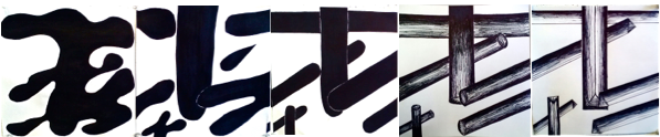
I did not like this project. I had a hard time transitioning my organic shape in to an inorganic shape. I feel like I drew the same thing over five times. My transition from slide three to four could have been smoother, or I could have added an extra slide in between the two. I also feel that there is not much a difference between slides four and five. My craft on this project id not the greatest and could be improved. i wanted the shape to at some point become three dimensional in order to create depth in my composition, however this process could have been smoother. Over all, I am not very happy with how this project turned out.
|
